Case study / University project / Brand identity
Museo Bernardino Rivadavia
An academic identity proposal for the Museo Argentino de Ciencias Naturales Bernardino Rivadavia.
Academic context
A proposal exploring the museum's identity.
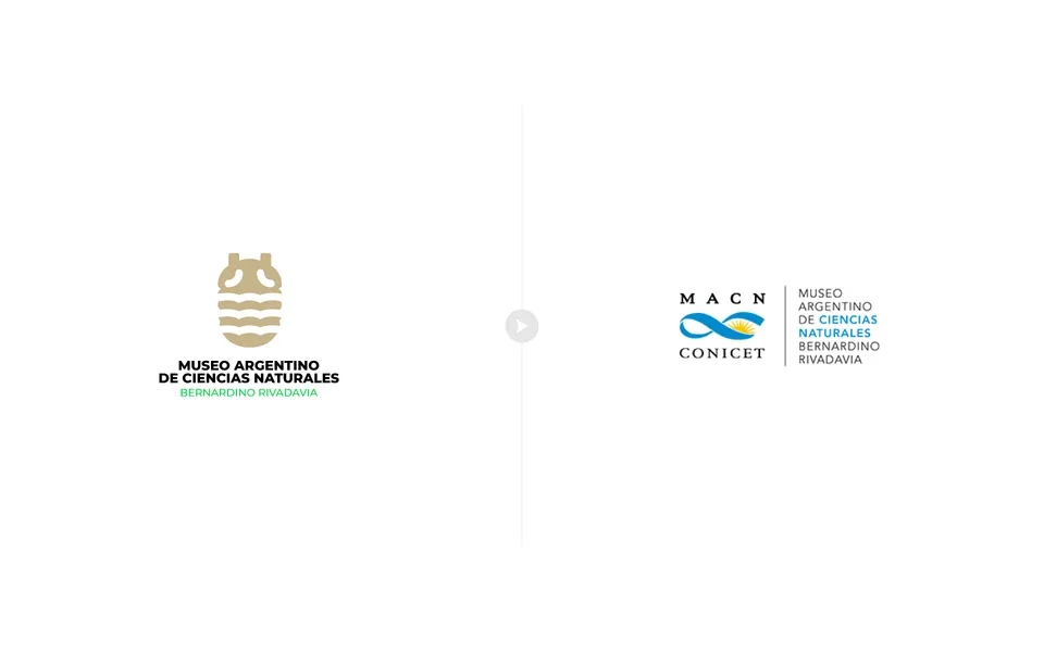
This university project explores an alternative visual identity for the Museo Argentino de Ciencias Naturales Bernardino Rivadavia. It brings together a symbol, its relationship to the institution's name and a series of applications.
The work is an academic proposal, not a commissioned project or an identity adopted by the museum. The case study follows the relationship between the proposed brand and its use on stationery, clothing and objects.
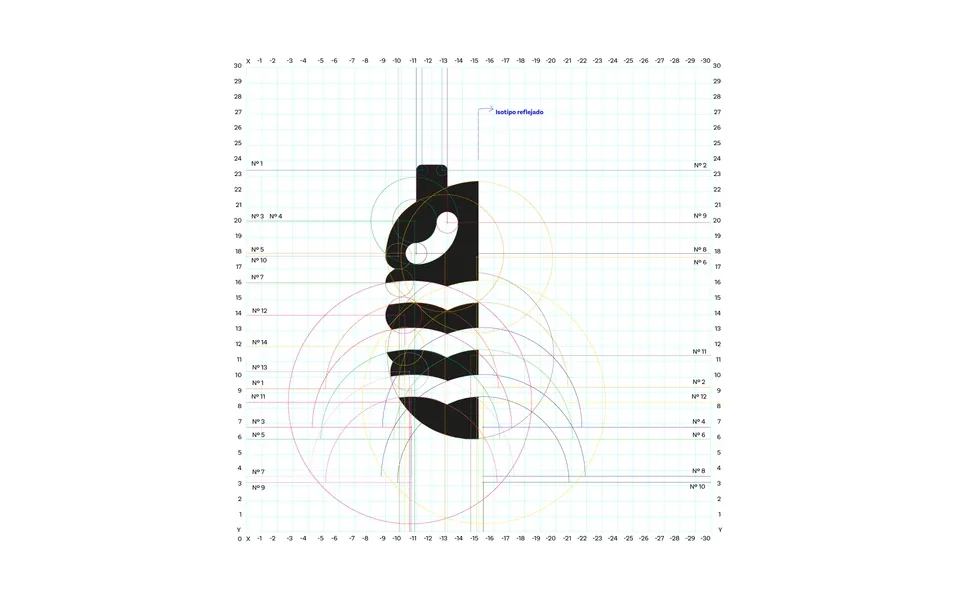
Symbol construction
A compact form built from curves and repetition.
The construction sheet documents a grid and arcs used to define the symbol. A vertical axis organizes the form, while curved bands create a rhythm that remains recognizable in its applications.
The composition places the symbol above the museum's name. A black typographic block carries the main name, with a green line distinguishing Bernardino Rivadavia.
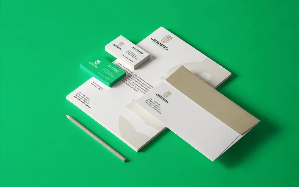
Color and stationery
A shared palette for institutional materials.
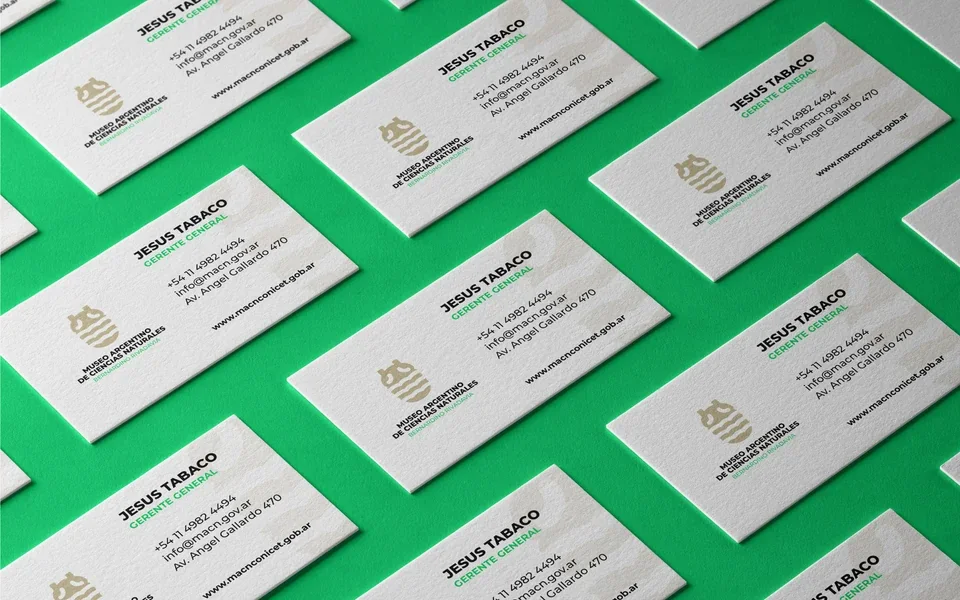
A sand tone identifies the symbol and supporting surfaces. Green adds contrast in roles and details, white leaves space for content, and black carries the main information.
Business cards, letterheads and envelopes share alignment and proportions. An enlarged symbol also serves as a background element, connecting the pieces without always repeating the complete logo.
Tools
Extending the system to other formats.
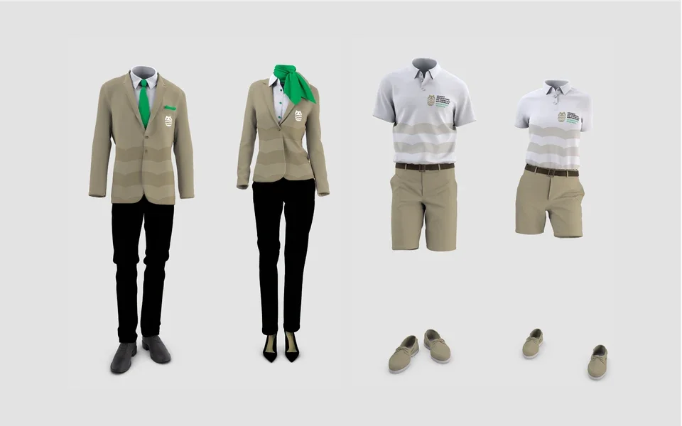
The clothing proposal carries the palette and the symbol's bands onto formal and everyday garments. Brand placement adapts to the size of each surface.
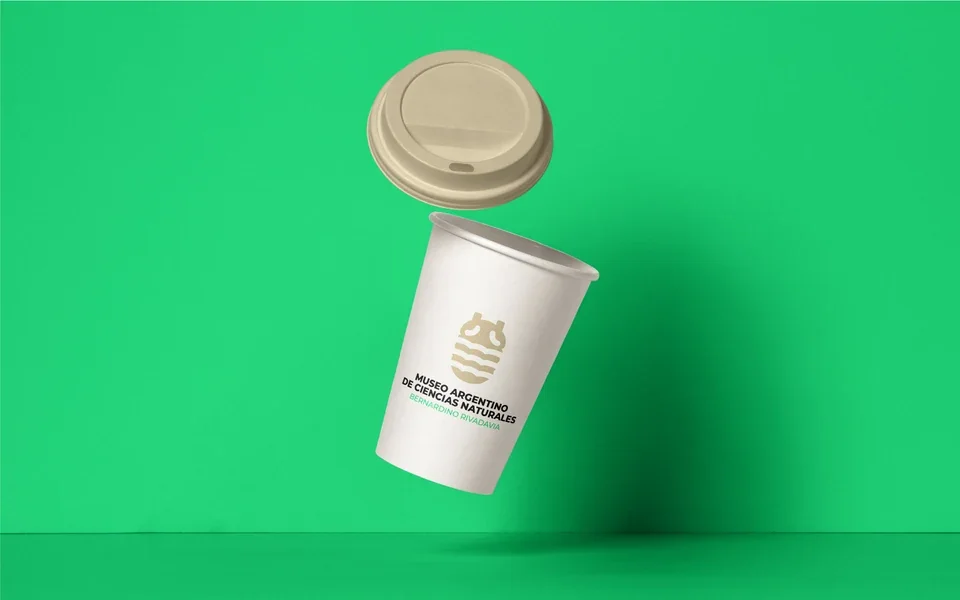
The cup explores another application scale, presenting the symbol and name on a light surface. These mockups explore the system's continuity beyond stationery.

Contact
Let's talk about your next project.
We can review your organization's context, content and design requirements.