Case study / CASA
CASA
Graphic design and printed materials that bring structure to internal communications.
Context and scope
Visual communication for the workplace.
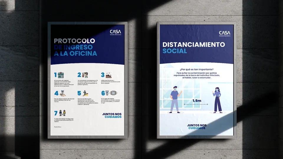
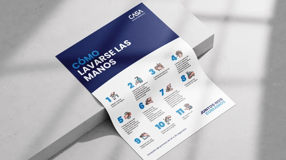
For CASA, I developed graphic design and printed materials for internal communications. The collection includes information posters and a printed sheet with illustrated instructions.
The work focuses on making information easy to consult: identifying the main topic, recognizing a sequence and finding the explanation for each instruction. Branding and graphic elements connect the different formats.
Design approach
A shared hierarchy across different formats.
Three composition principles connect the information to its use in print.
- 01
Establish a reading order
The heading introduces the topic, numbers organize the instructions, and supporting copy explains each step. This hierarchy carries through the posters and the printed information sheet.
- 02
Connect text and imagery
Illustrations accompany the instructions and help readers identify each action. Each combination of number, image and explanation forms a single reading unit.
- 03
Maintain consistency across formats
The logo placement, blue headings and light-blue accents connect the pieces. The composition changes with the content while following a consistent visual approach.
Composition and balance
Order, contrast and room to read.
Headings occupy a clearly defined area, separated from the information below by a curved transition. The logo sits at the top, and the main message is noticeably larger than the supporting explanations.
Numbered modules organize the body content without turning it into a continuous block of text. Margins, alignment and spacing help readers move through each piece and connect illustrations with their instructions.
Color and typography
A recognizable visual system in print.
Deep blue anchors the headings and institutional identity. Light blue highlights words and numbers, while white areas provide space for instructions and illustrations.
Bold uppercase headings establish the first level of the hierarchy. Sans-serif body text supports concise explanations and a consistent appearance. The restrained composition is balanced by approachable illustrations.

Contact
Let's talk about your graphic design project.
If your team needs printed materials or stationery, we can review the formats, content and scope together.