Case study / Centro de Vuelo Zárate
CVZ
Logo and stationery design for a visual identity rooted in aviation.

Context and scope
An identity for Centro de Vuelo Zárate.
For CVZ, I designed the logo and its stationery applications. The project combines a symbol, initials and the organization's name with institutional materials: business cards, envelopes and letterheads.
The aircraft becomes a visual element that can accompany the name or stand on its own. This relationship provides the starting point for the wider graphic system.
Logo design
A front-facing symbol and a horizontal composition.
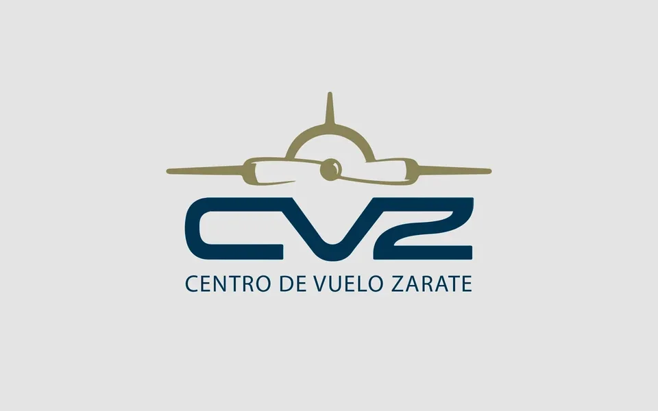
The symbol depicts an aircraft from the front. Its wings establish a horizontal axis, with the propeller forming the central detail. Below, the broad CVZ letterforms balance the symbol above.
The full name forms a third level in the hierarchy. The relationship between symbol, initials and name supports both complete logo compositions and applications that use the symbol alone.
Design approach
From the logo to its applications.
Three design principles maintain the relationship between the brand and its stationery.
- 01
Symbol and wordmark
Connect a front-facing aircraft symbol with the initials CVZ and the name Centro de Vuelo Zárate. The composition brings together an aviation reference and the organization's name.
- 02
Visual hierarchy
Distinguish the brand, contact details and document content. Scale, alignment and spacing keep information organized across different formats.
- 03
Applying the system
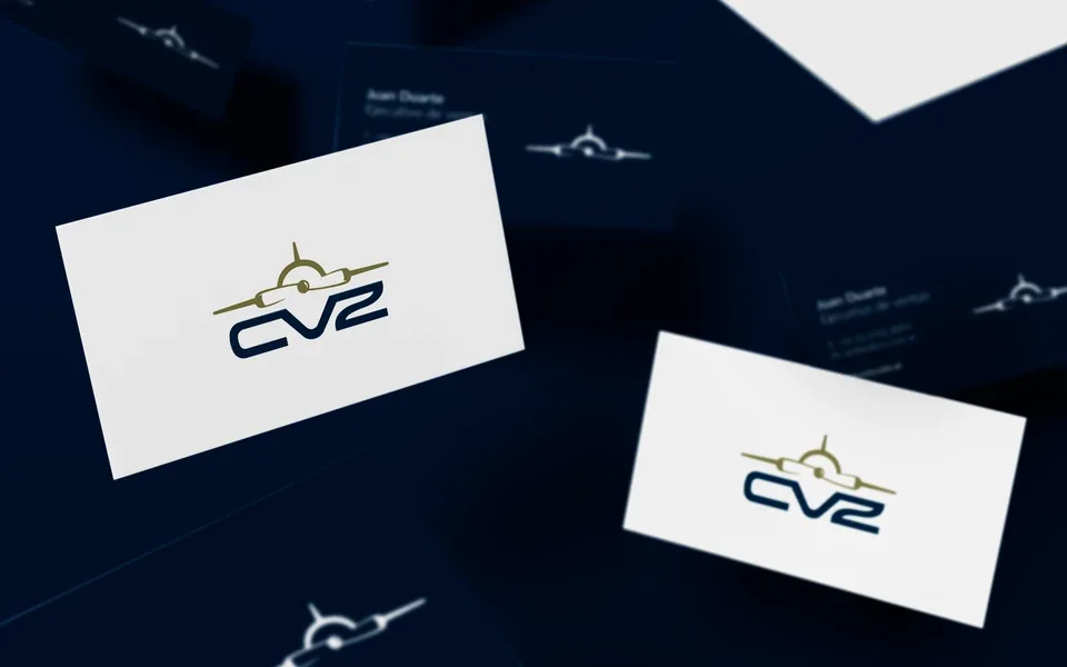
Extend the logo and its visual elements to business cards, envelopes and letterheads. Light and dark versions, together with the symbol pattern, connect the pieces.
Color and typography
A restrained foundation for institutional communication.
Deep blue anchors the identity and backgrounds. Olive distinguishes the symbol in the color version, while white supports the logo on dark surfaces and gives the information room to read.
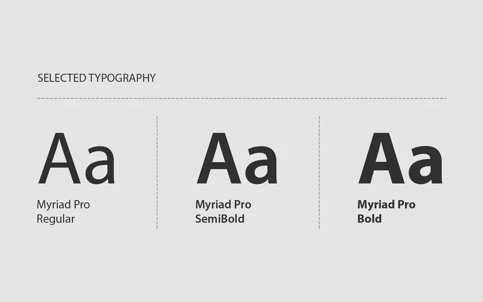
Myriad Pro in Regular, Semibold and Bold organizes supporting information. Its weights distinguish names, roles and contact details without introducing additional typefaces.
Stationery
Continuity across every printed format.
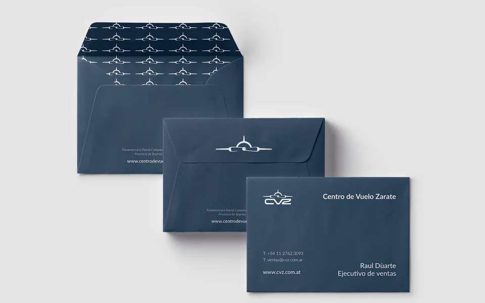
On the envelopes, the symbol serves as an exterior signature and an interior pattern. Business cards give the brand and contact information distinct areas within a clean composition.
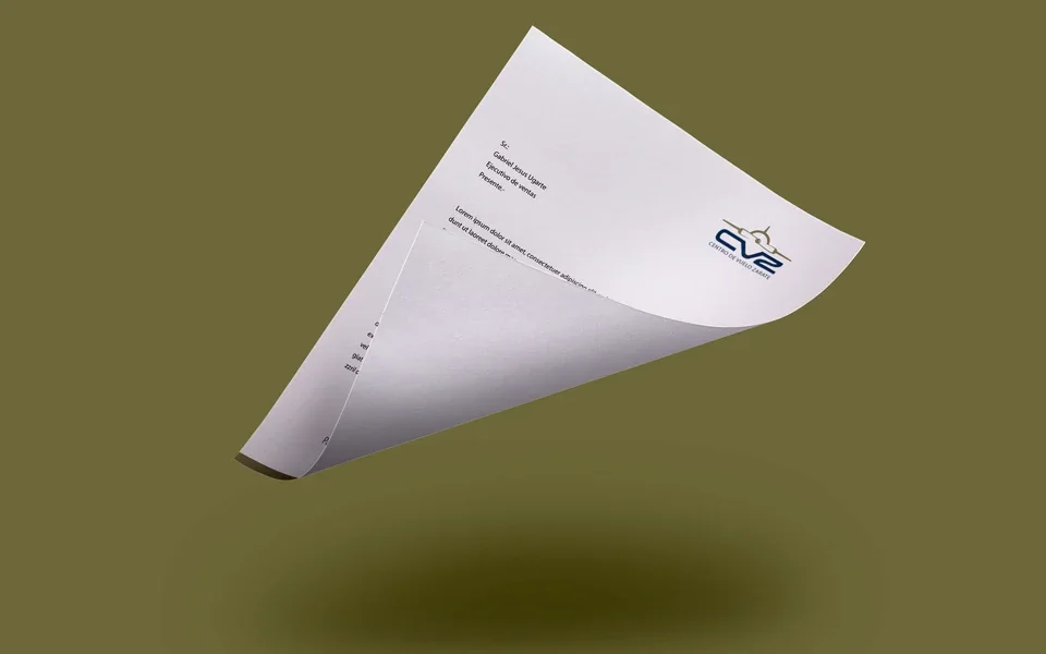
The letterhead leaves most of the page available for content. The logo has a clear presence at the top without competing with the document text.

Contact
Let's talk about your visual identity.
If your organization needs a logo and stationery, we can discuss the requirements and scope of the project.