Case study / Digital and institutional communication
Fecundar Perú
Social media, website and stationery design with a shared visual approach.
Context and scope
Continuity across communication channels.
For Fecundar Perú, I worked on social media content, the website proposal and stationery applications. The project brings together different formats that need a clear connection to the brand.
Turquoise, white and photography form the shared foundation. Each piece organizes its message around the available space and context of use.
Social media
A visual direction for varied content.
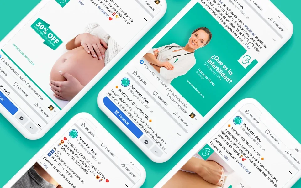
Posts combine photographs, headings and color blocks to present the center's activities and communications. Logo placement and recurring turquoise make the pieces recognizable within a social feed.
The composition separates the main message from supporting details. Changes in scale organize headings, dates and names without giving every element equal weight.
Web design
Introduction, services and contact in one system.
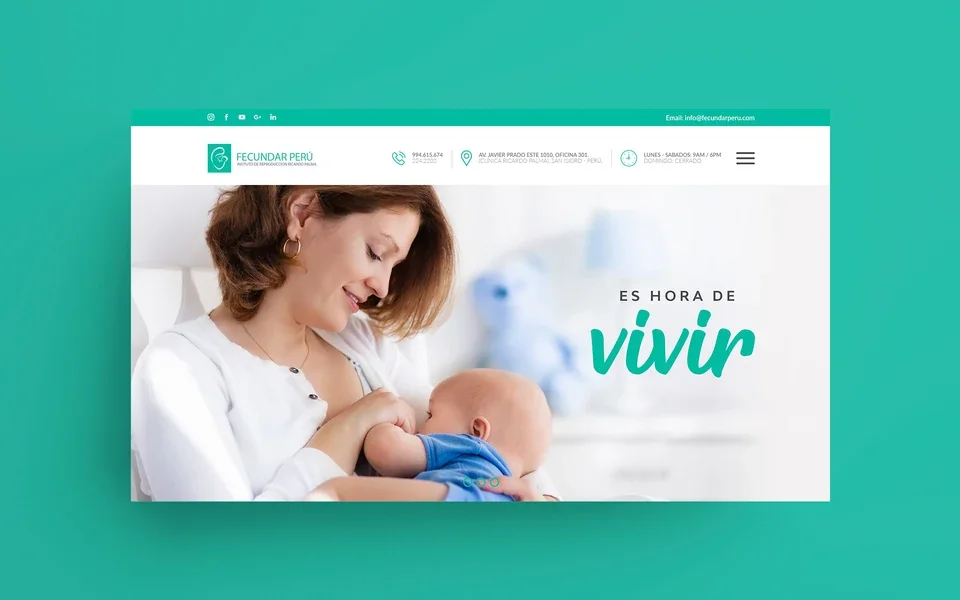
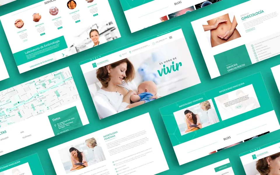
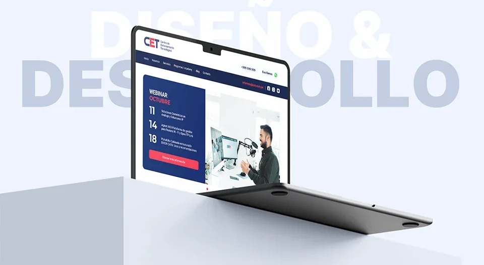
The web proposal groups content into modules: an introduction to the center, services, supporting information, blog and contact. Images introduce each area, and text blocks explain its content within a shared hierarchy.
White surfaces provide room to read, while turquoise connects headings, buttons and backgrounds. Repeated alignment and components maintain continuity between the homepage and service pages.
Stationery
A consistent presence in print.
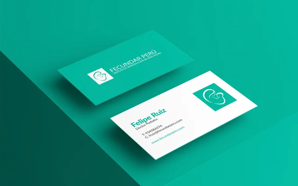
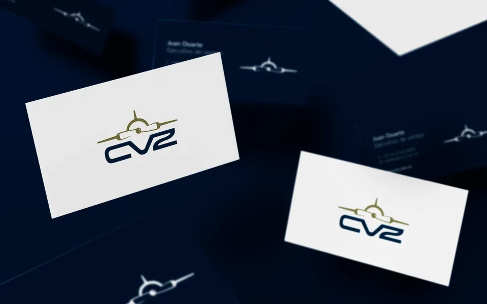
Business cards distinguish the brand, name, role and contact information. White and turquoise versions preserve contrast and distribute information without crowding the surface.
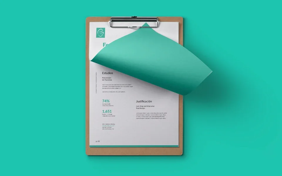
On documents, the logo occupies the header and content has clearly spaced areas. The stationery extends the digital materials' visual language into institutional use.
Contact
Let's talk about your next project.
We can review your organization's context, content and design requirements.