Case study / Centro de Entrenamiento Tecnológico
CET
A website experience presenting technical services, training programs and activities in one place.
Context and scope
Organizing the offering to make it easier to explore.
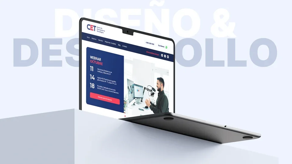
CET combines technology training and specialist services. The web and UX/UI design work focused on giving this offering a shared structure for people seeking training or technical assistance.
The proposal distinguishes services, programs and institutional content. Each journey presents information progressively while keeping inquiry channels visible.
Planning and architecture
Structure before interface.
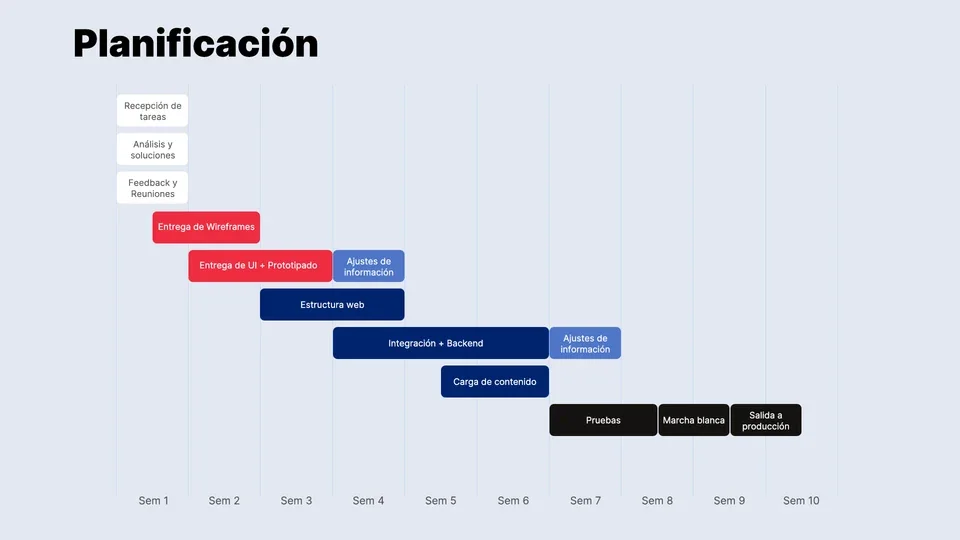
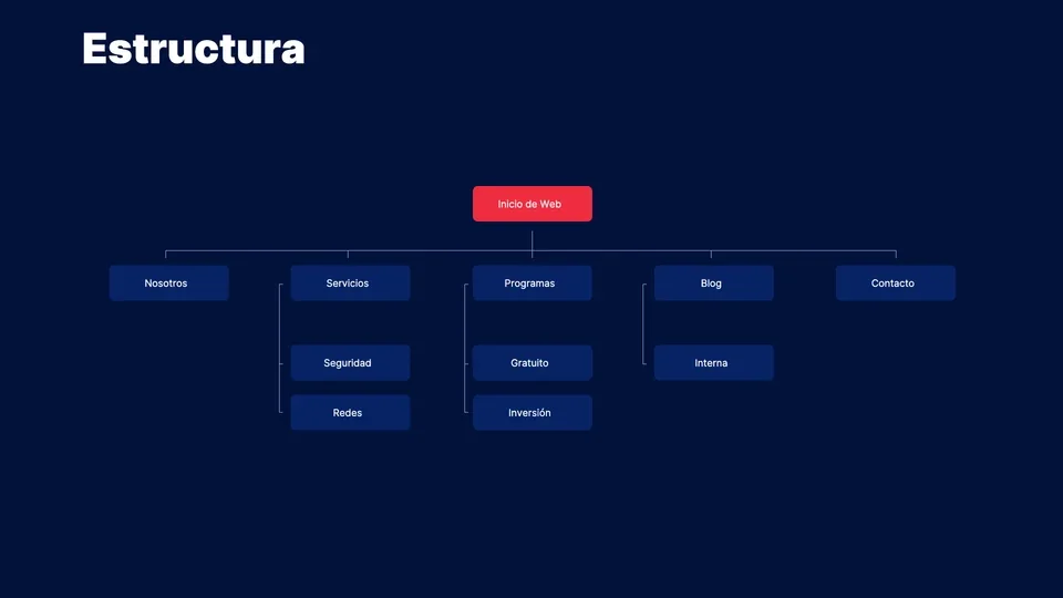
Planning includes analysis, review, wireframes and prototyping. The sitemap separates About, Services, Programs, Blog and Contact. Services distinguishes Security and Networks, while Programs organizes the training options.
My contribution focuses on web design and user experience. The documentation connects structural and interface decisions with later project stages.
Wireframes
Defining what people need on each screen.
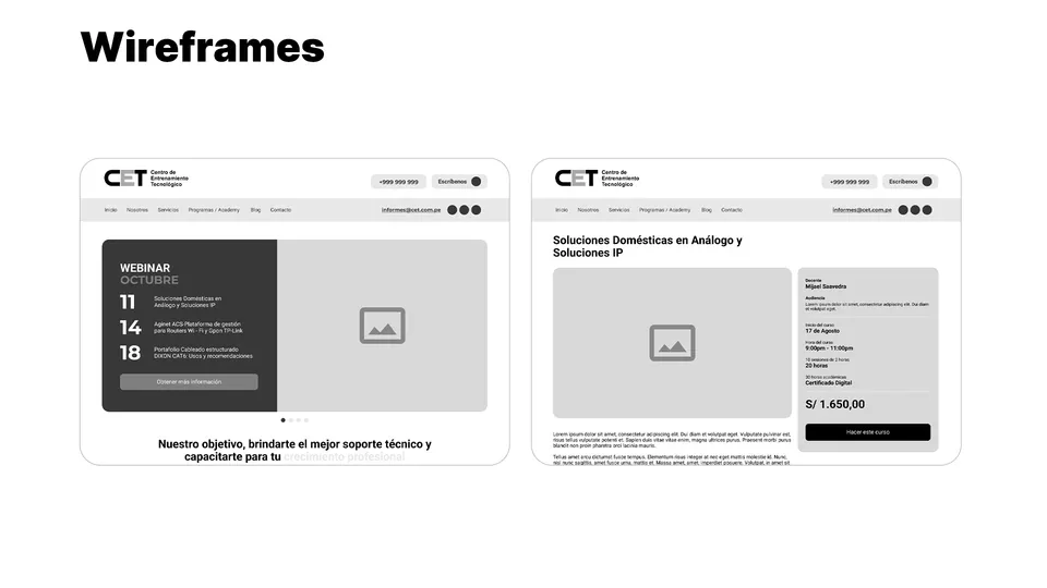
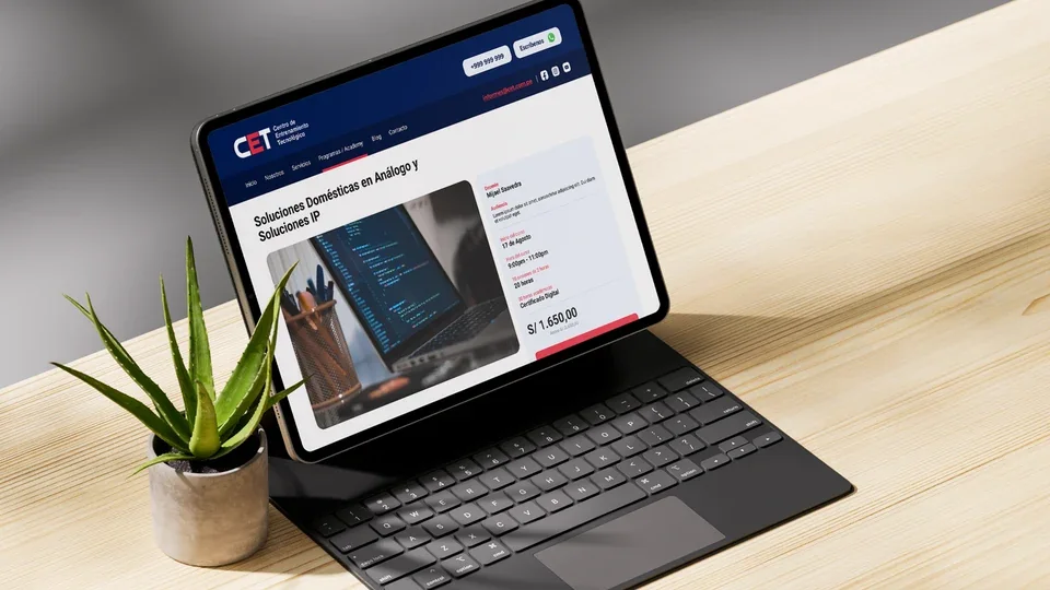
Wireframes establish the hierarchy for the homepage and a course detail page. Activities feature prominently on the homepage; course pages pair the main content with instructor, schedule and registration information.
This structure helps organize information before the visual design stage. Repeated cards and supporting blocks give the journey a recognizable logic.
Visual system
Contrast, rhythm and a consistent identity.
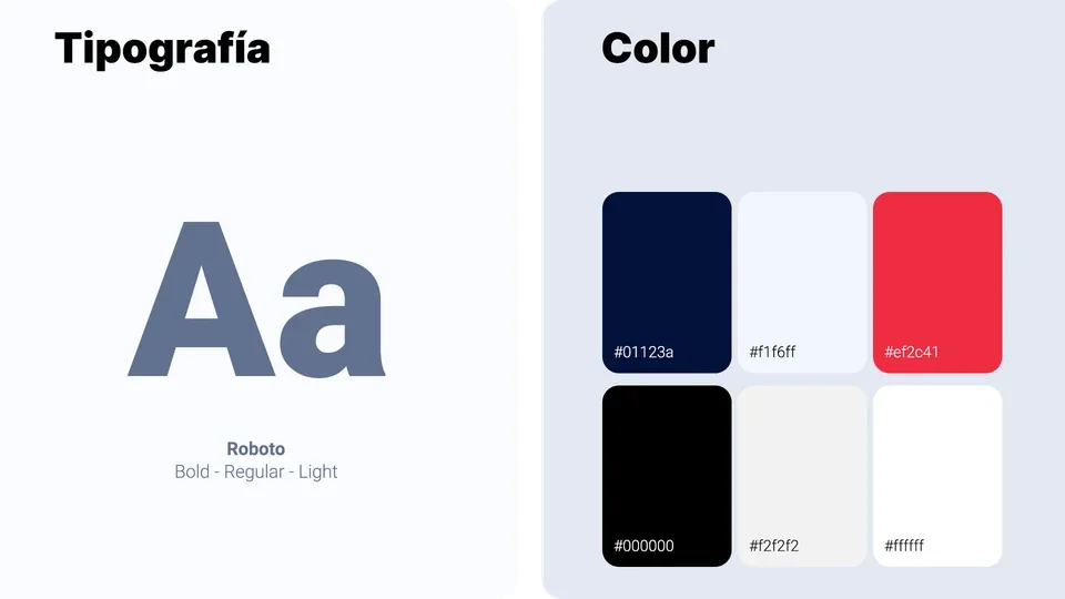
Deep blue connects navigation and backgrounds. Red highlights actions and relevant details, while lighter tones separate content areas without overloading the composition.
Roboto in Light, Regular and Bold organizes headings, descriptions and technical details. Spacing and a modular grid give a layered offering room to breathe.
Responsive design
A shared approach on desktop, tablet and mobile.
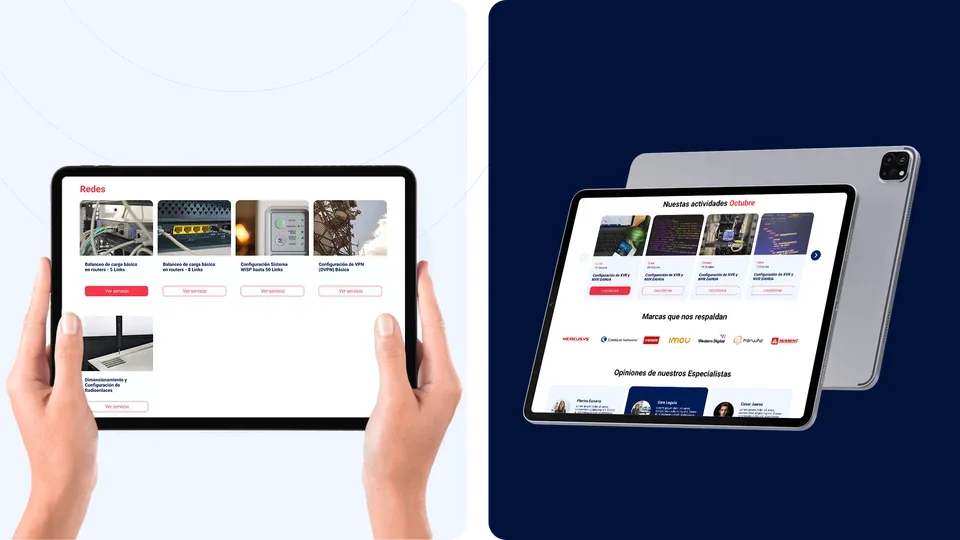
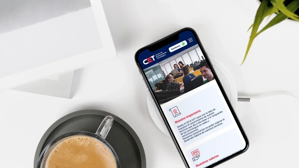
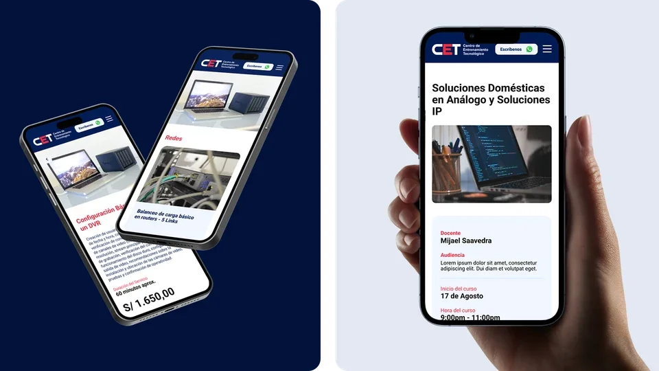
Service and activity grids adapt to each format. Listings retain a clear relationship between image, description and action; on mobile, content follows a vertical sequence.
Institutional and course pages share colors, cards and hierarchy, helping users move between sections while retaining CET's visual identity.
Contact
Let's talk about your next project.
We can review your organization's context, content and design requirements.