Case study / UX / UI · WEB & APP
BBVA Benefits
An experience to discover everything you can enjoy.
Context and scope
Making benefits visible.
BBVA Benefits brings together discounts and offers at selected businesses. The redesign aimed to simplify navigation across web and app and make less familiar options easier to discover.
I was responsible for the entire design stage during my time at Evolbit. The proposal connects the structure of the experience with interface design.
Design process
Designing in stages.
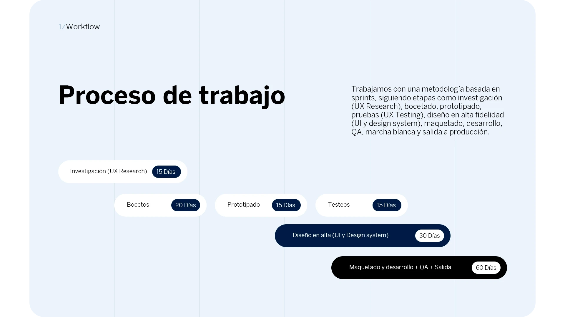
The project followed sprints for research, sketching, prototyping, testing and high-fidelity design. The schedule connects these stages with the development of the visual system.
The board also places design within the wider project lifecycle: implementation, development, QA and release. My contribution focused on the design stage.
Wireframes
Structure before styling.
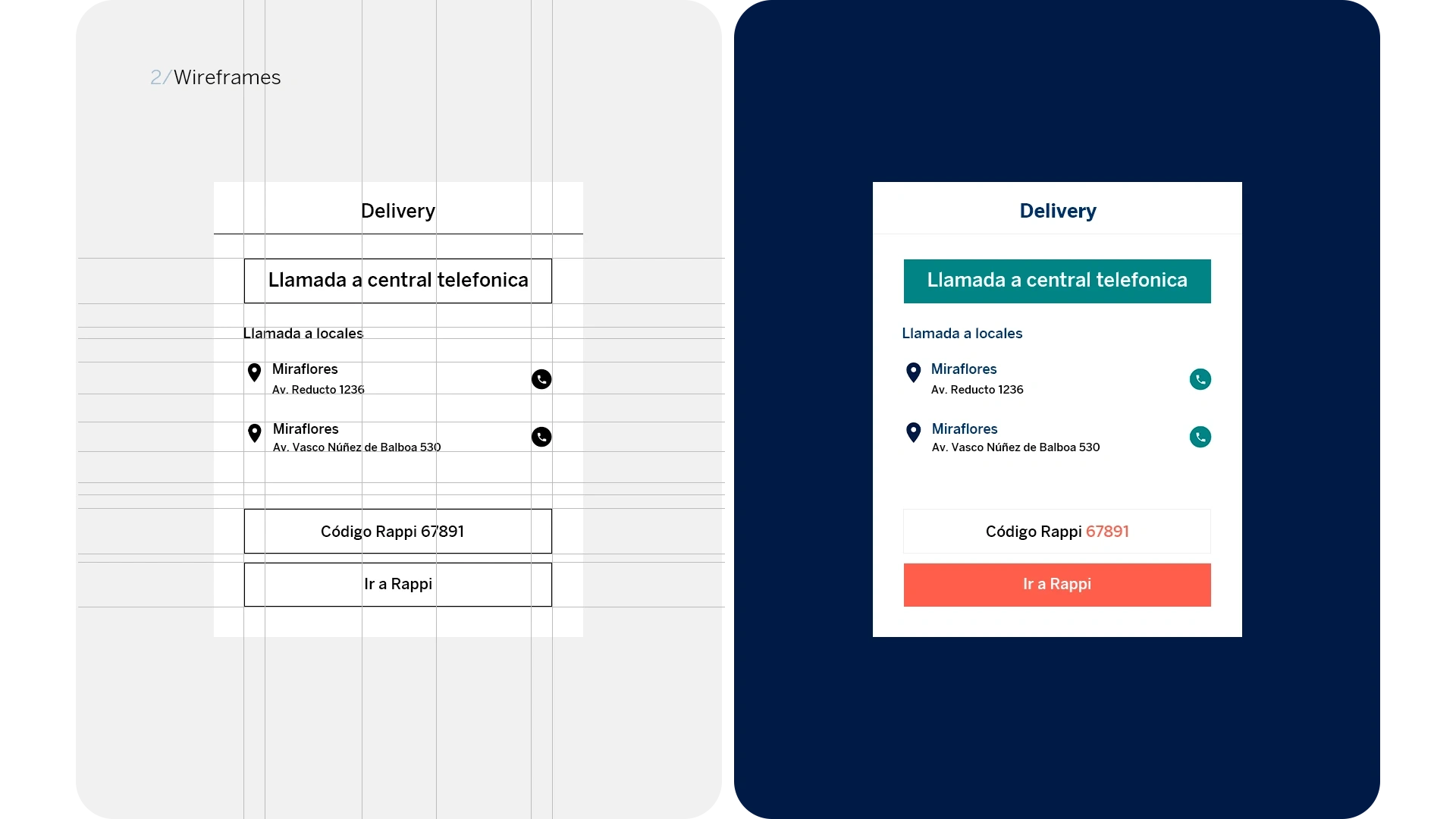
The delivery module separates the central phone line, contact with each location and access to Rappi. The wireframe establishes this hierarchy before adding color and typography.
The final interface retains that structure and uses contrast to distinguish actions. Addresses, phone numbers and the promotional code have defined places within the module.
Web experience
The offer and its conditions.
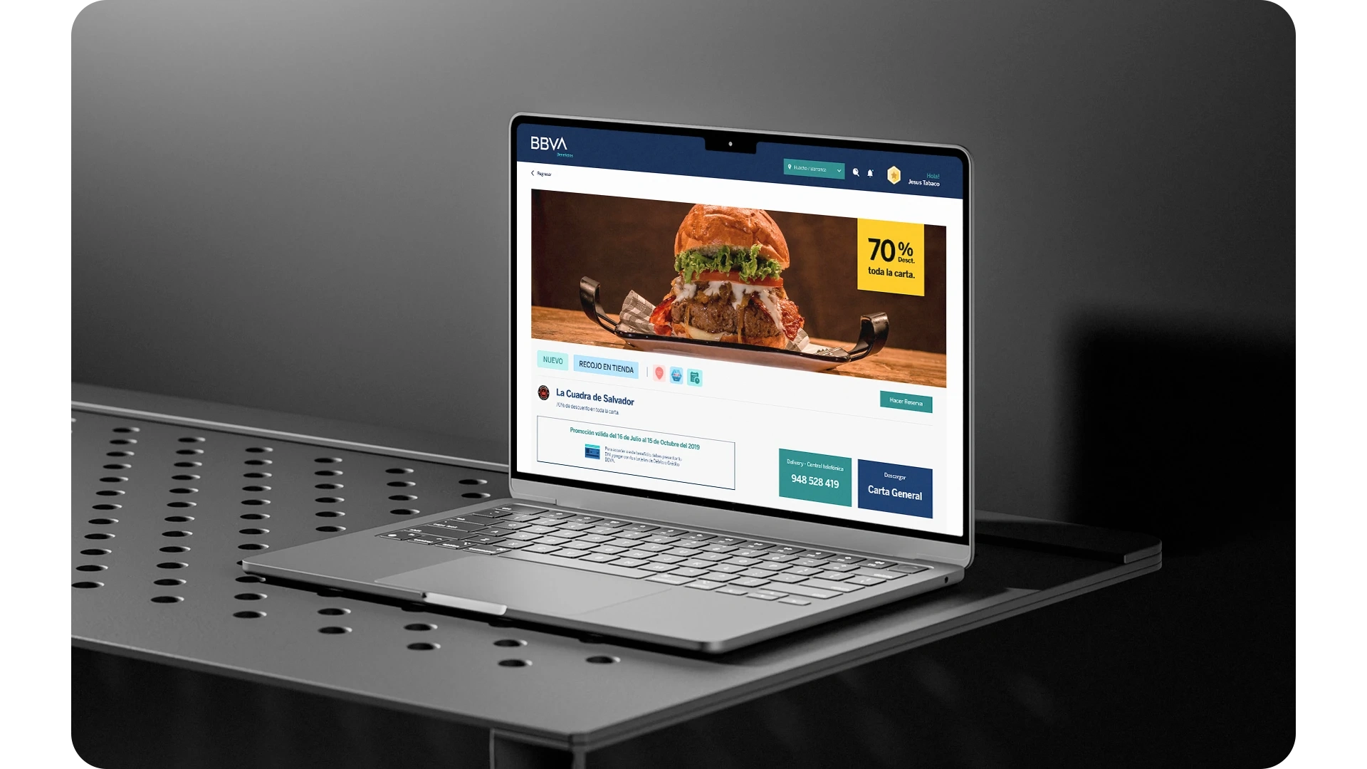
On desktop, the detail page highlights the business image and discount. Below, it brings together the offer period and options to book, order delivery or view the menu.
The horizontal layout separates information from actions. The header retains the location and user profile reference.
First access
Introducing the updated experience.
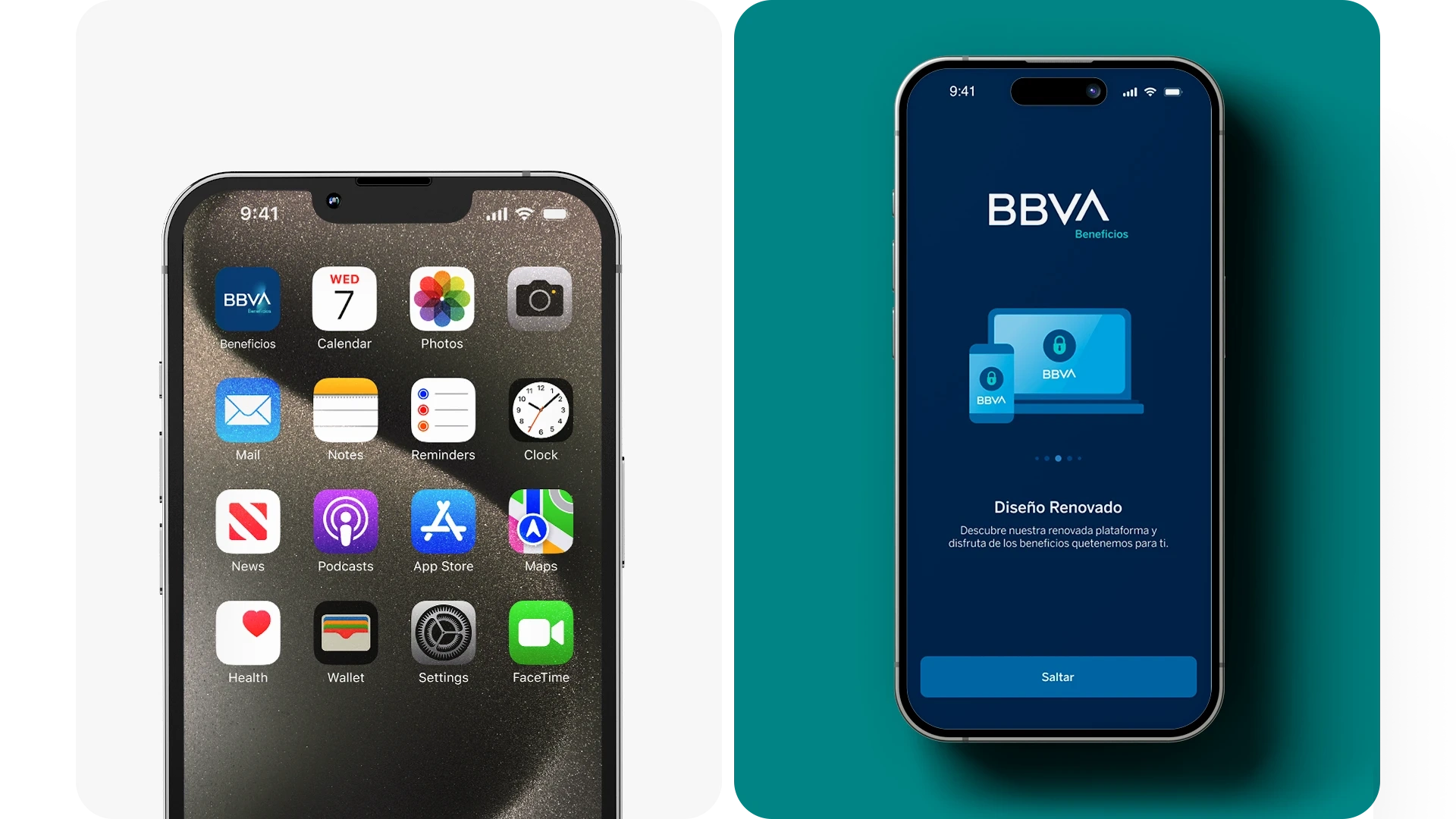
The app icon retains the BBVA identity on the phone screen. On entry, onboarding introduces the updated platform and available benefits.
The screen combines an illustration, a short message and a progress indicator. A skip option lets users continue without going through the full introduction.
Typography and color
Continuity with the BBVA identity.
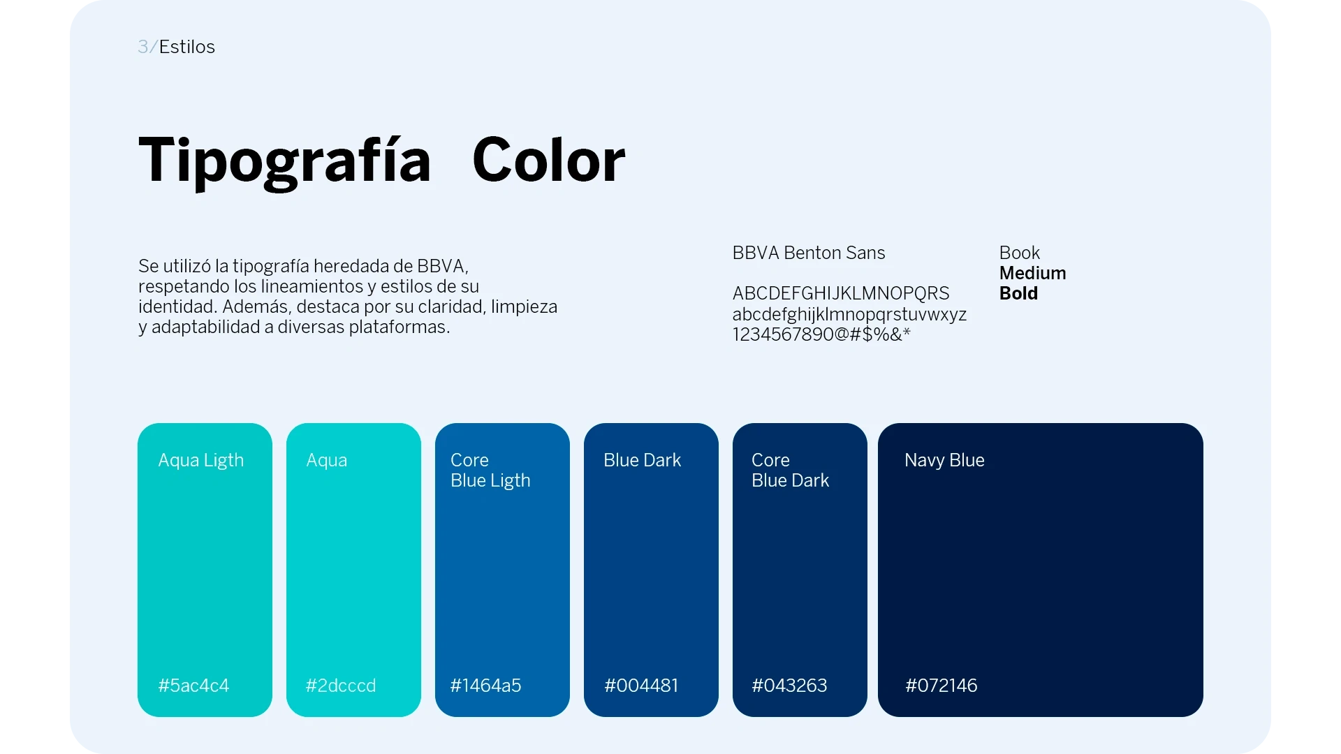
The design uses BBVA Benton Sans in Book, Medium and Bold weights. These variations distinguish headings, actions and supporting text while respecting brand guidelines.
The palette combines aqua and blue tones, from brighter accents to Navy Blue. Their use connects backgrounds, controls and information levels across platforms.
Business details
From benefit to action.
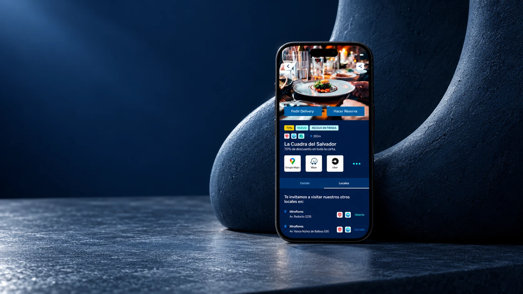
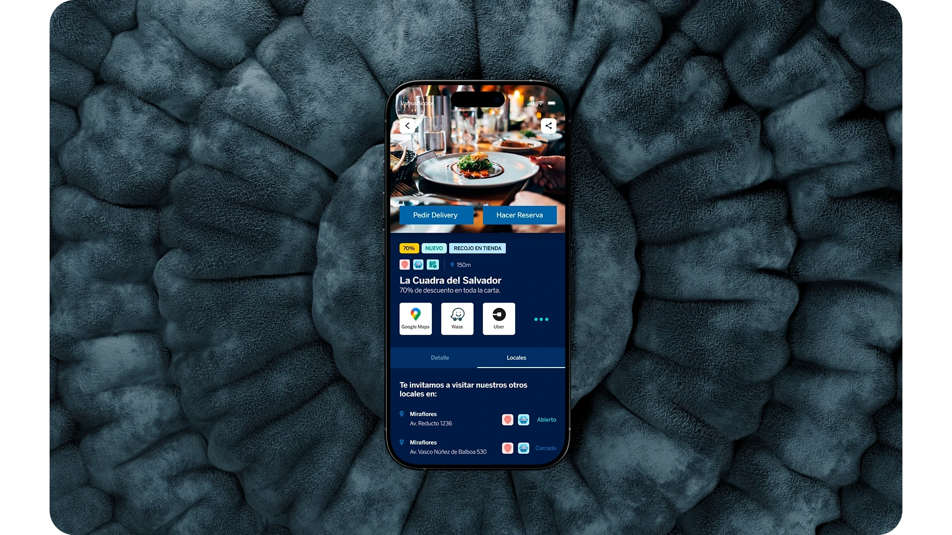
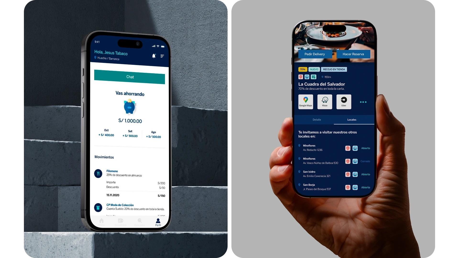
The mobile detail page brings together the discount, delivery and booking options, and access to maps and transport. Benefit information stays close to the actions needed to use it.
Tabs separate the details from the list of locations. Each branch shows its address and opening status, allowing users to review alternatives within the same page.
Component system
Shared rules for every screen.
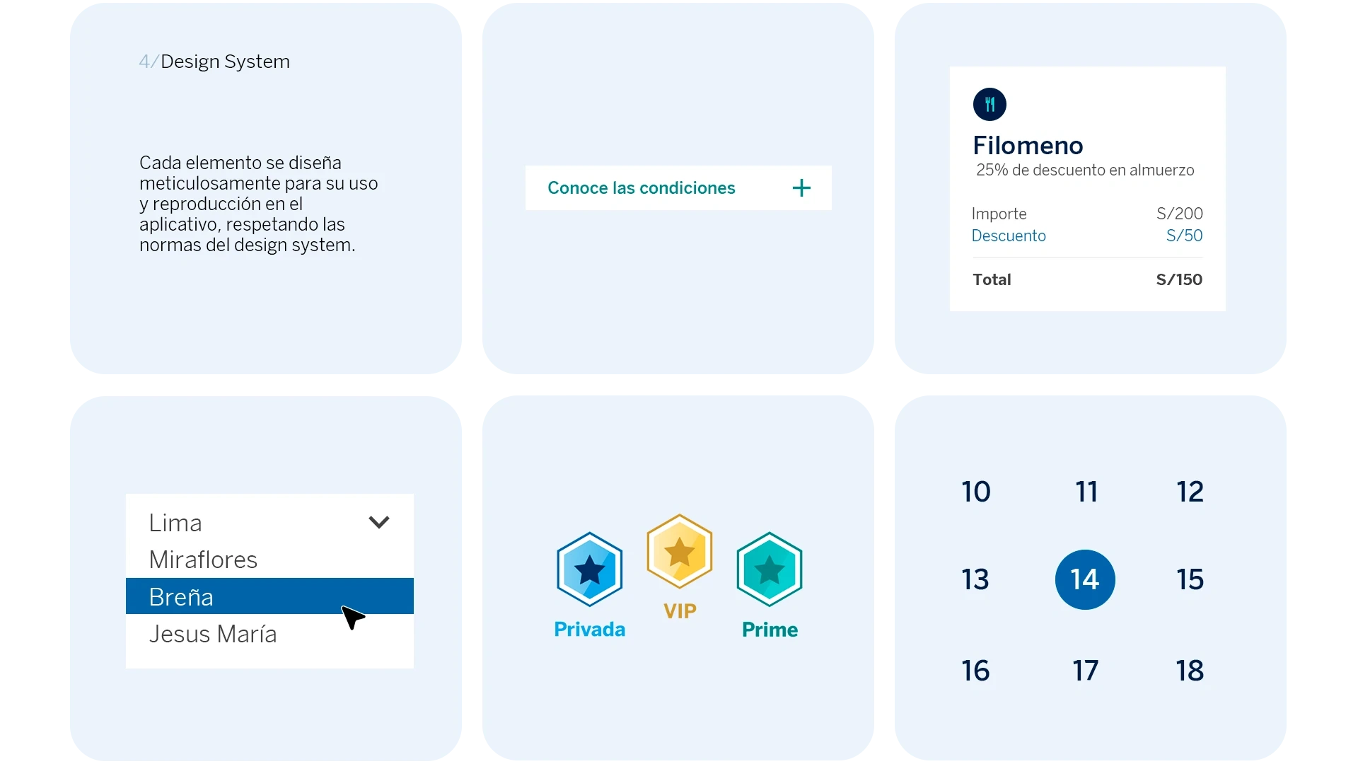
The system brings together conditions modules, discount summaries, location selectors, badges and calendars. Each element serves a specific function within the experience.
Consistent typography, color and states support reuse across screens. A transaction summary, for example, distinguishes the amount, discount and total.
Review and tracking
Showing savings and locations.
The profile presents accumulated savings, a monthly breakdown and transactions. Each record connects the business with the amount, discount and transaction total.
The location view uses a different hierarchy: address, availability and services. Both views organize detailed information for reading on a mobile screen.
App home
Different ways to discover.
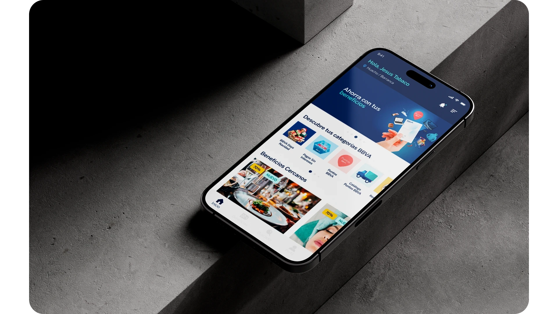
The home screen brings together a featured campaign, BBVA categories and nearby benefits. This sequence offers starting points based on news, interests or the user’s location.
Cards show the business image and highlight discounts and new offers. Bottom navigation keeps the main areas of the app available.
Contact
Let's talk about your next project.
We can review your organization's context, content and design requirements.