Case study / Profuturo AFP
Profuturo
A website experience designed around clear information and pension members' needs.
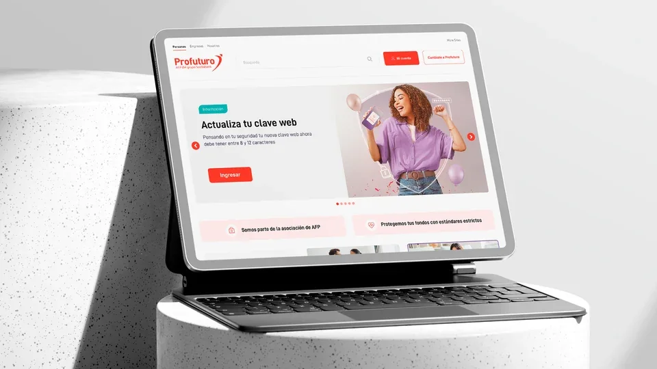
Context
Financial information, easier to navigate.
This project explores a renewed web experience for Profuturo AFP. The aim is to organize information about pension funds, procedures and services for people with different needs.
The proposal combines an updated interface with a content structure that is easy to explore. Account access, updates and member guidance have distinct spaces rather than competing for attention.
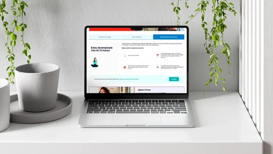
Composition and balance
A structure that gives content room.
The grid organizes the page into modules: navigation, featured content, shortcuts and information blocks. Alignment and spacing distinguish each level before readers move into the details.
White and gray backgrounds provide visual breathing room. Everyday photography and illustrations create an approachable feel, while color accents add variety without overshadowing the information.
Design approach
Principles that connect the proposal.
The proposal brings together four areas: content, composition, the visual system and responsive layouts.
- 01
Content organization
Separate information by audience and need. Navigation distinguishes individuals, businesses and the organization, while account access and pension-provider switching retain recognizable positions.
- 02
Hierarchy and composition
Give each block a clear role: introduce an update, explain a requirement or support an action. Cards, headings and whitespace organize the reading order without relying on color alone.
- 03
Visual system
Use consistent typography, buttons, icons and information modules. Repetition connects pages with different content and levels of detail.
- 04
Responsive layout
Reorganize modules to suit the available width. On mobile, content moves into a single column and key actions remain near the top of the page.
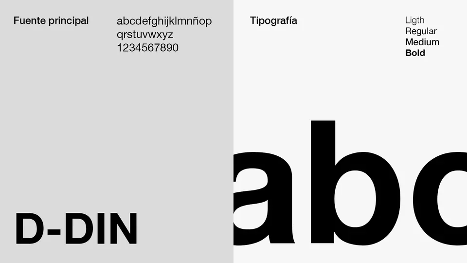
Visual system
Typography and color with clear roles.
D-DIN provides the typographic foundation. Its weights distinguish headings, explanations and actions while keeping the reading experience consistent across screens.
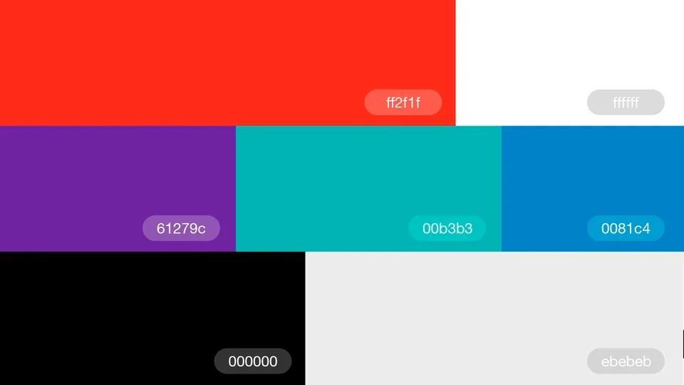
Brand red draws attention to key links and actions. Turquoise, blue and violet extend the palette to organize modules and highlight content, while white, black and gray establish contrast and rhythm.
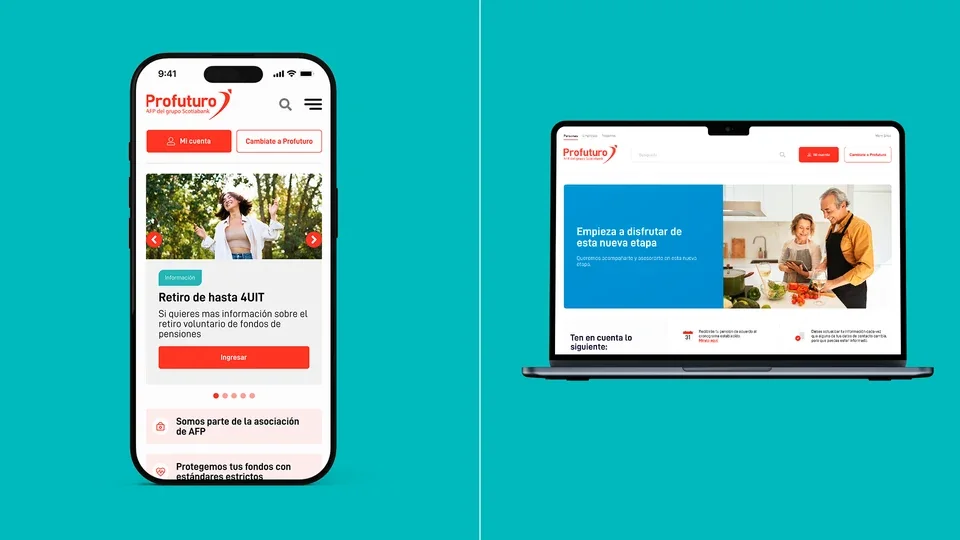
Mobile experience
Clear priorities on a smaller screen.
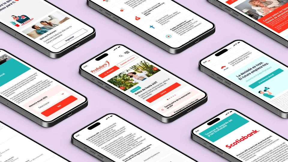
On mobile, cards stack and information blocks follow a vertical sequence. Search and navigation become more compact, while account access and the option to change pension provider remain visible.
Consistent buttons, icons and card styles connect the mobile and desktop experiences. The layout adapts to the device while retaining the elements that identify the brand.
Contact
Let's talk about your next digital project.
If your team is considering a new platform or a service redesign, we can discuss the scope and design requirements.