Case study / Logo design
Suplex
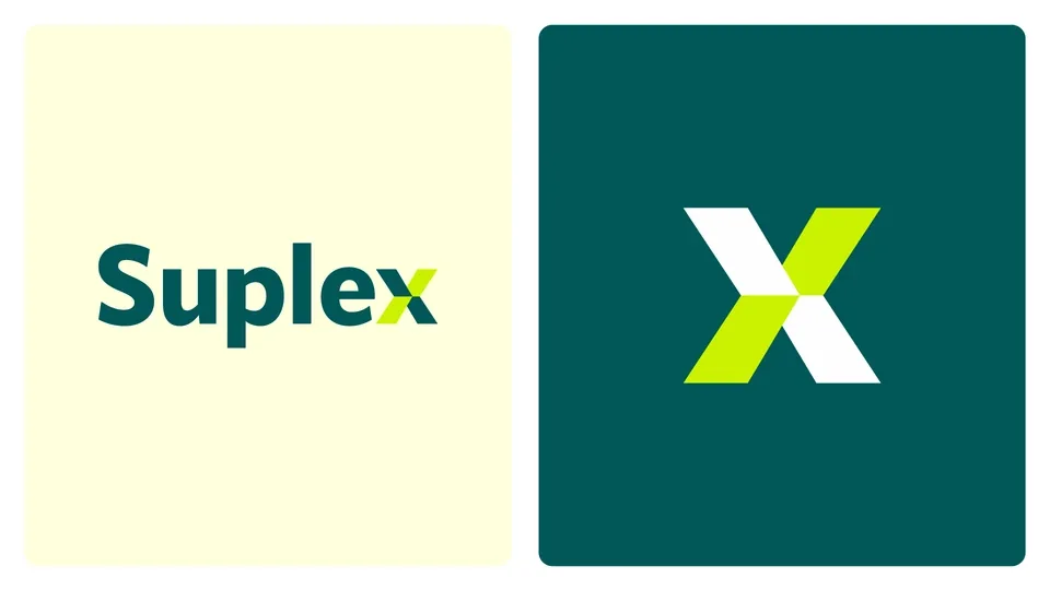
A logo that incorporates a geometric x into the name and allows it to work as a standalone symbol.
Context and scope
A wordmark with a distinctive detail.
The Suplex project focuses on logo design. The proposal combines a name set in broad letterforms with an x built from diagonal segments, creating the brand's distinctive detail.
The symbol can accompany the name or appear independently. The presentation explores this relationship and shows applications that help assess its presence across formats.
Form and composition
The x as a final letter and a symbol.
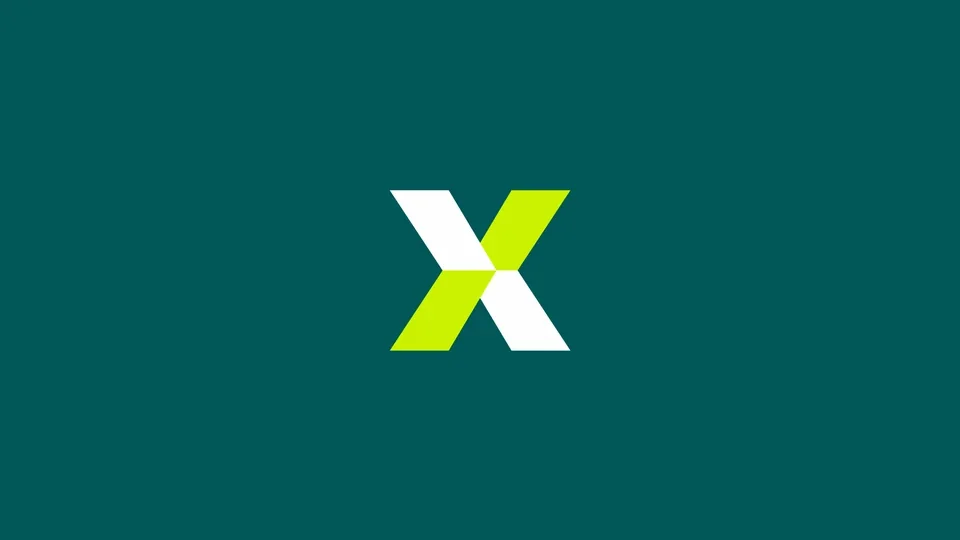
The final letter is built from four planes meeting at a central point. Alternating colors distinguish its diagonals, making it recognizable within the word and on its own.
The rest of the name retains a compact composition. The balance between the letters' weight and the size of the x keeps the distinctive detail connected to the wordmark.
Color and typography
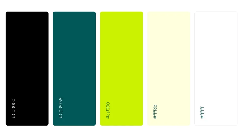
Contrast between a deep base and a vivid accent.
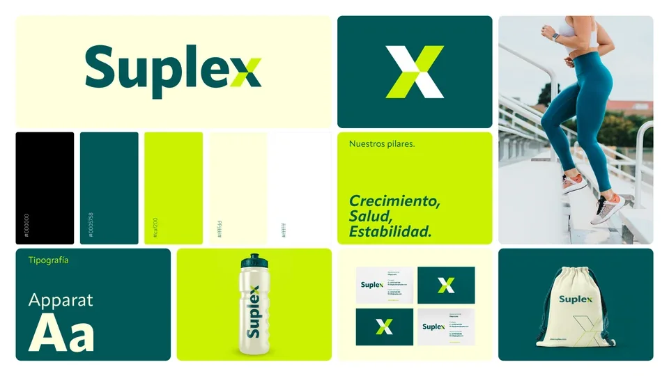
Deep teal supports the wordmark and dark backgrounds. Lime highlights the symbol's segments, while white and cream provide contrasting surfaces for the brand.
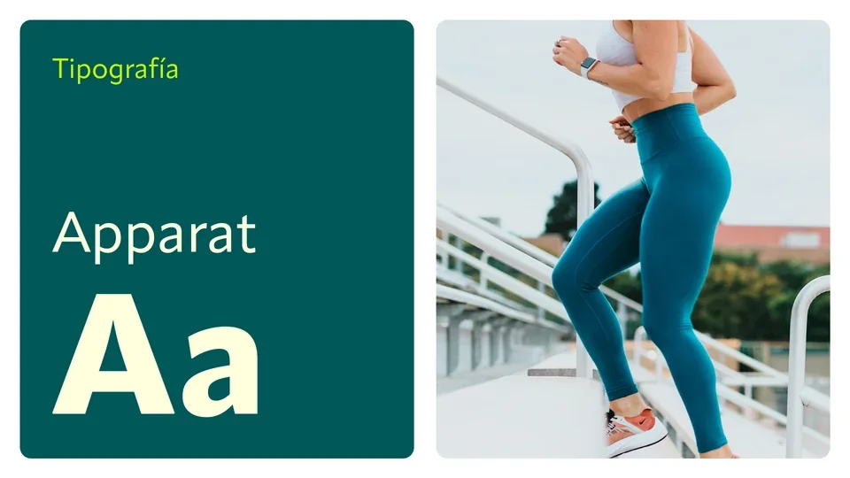
Apparat is the typeface documented in the project. Its use in the presentation and supporting text complements the wordmark without introducing unnecessary graphic elements.
Logo applications
Exploring the brand in use.
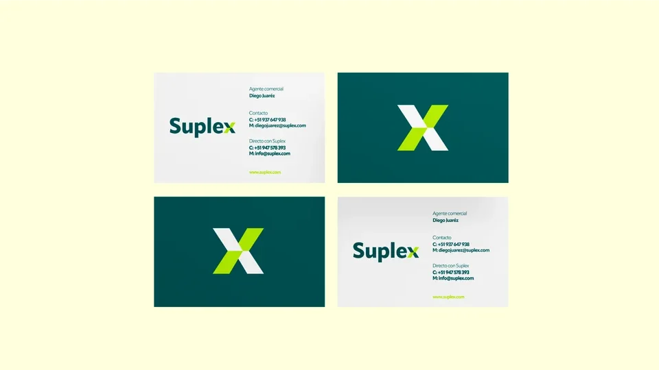
The business cards pair the complete wordmark with contact information and reserve the reverse for the symbol. This shows how both elements work separately.
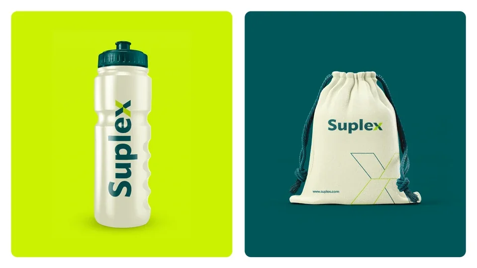
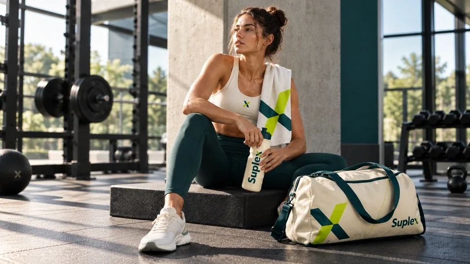
On the bottle and bag, the logo changes orientation and scale. The mockups retain the palette and explore the x at larger sizes and in outline form.
Visual overview
A system built around the logo.
The overview brings together the wordmark, symbol, palette and applications. It reveals the recurring elements and how they relate to one another.
The proposal keeps a simple core: the Suplex name and a recognizable x. Color and proportion extend that reference across the presentation materials.
Brand applications
An identity in a sports setting.
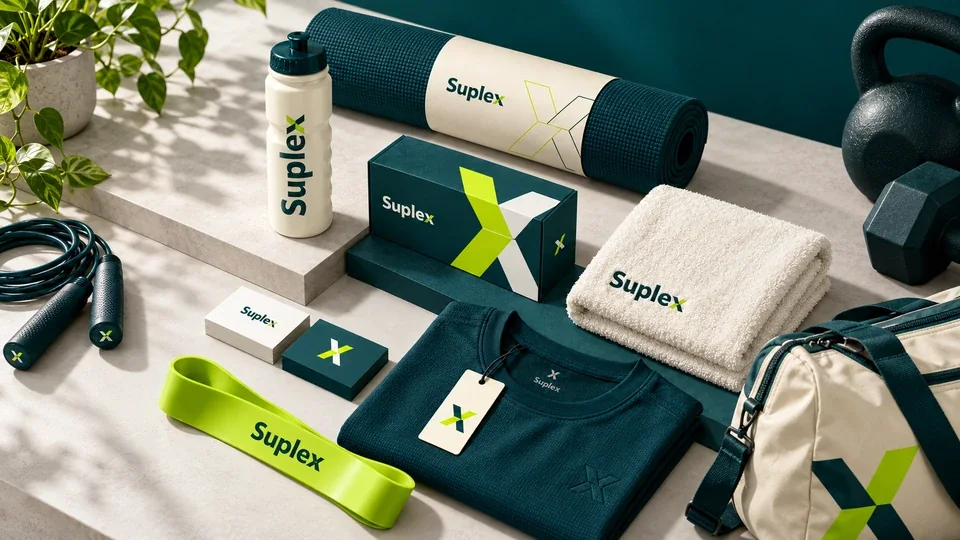
The new visualizations present the brand on clothing, a bottle, bag, towel and training accessories. The full signature appears alongside the x symbol at different scales.
Petroleum green, lime and light tones connect the pieces. The collection shows how the same visual language can accompany products and situations of use.

Contact
Let's talk about your next project.
We can review your organization's context, content and design requirements.