Case study / Digital publication / Editorial design
Latitud25
Web and UX/UI design for a publication combining news, articles, video and audio content.
Context and scope
An editorial experience with its own voice.
The Latitud25 project covers the publication's homepage, topic listings and reading pages. My work focused on web and UX/UI design: organizing content and connecting the journey from discovering a story to reading it.
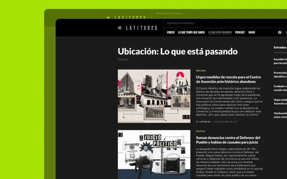
The proposal pairs a high-contrast identity with more restrained reading areas. Editorial imagery has a strong presence, while categories, headlines and dates help identify each publication.
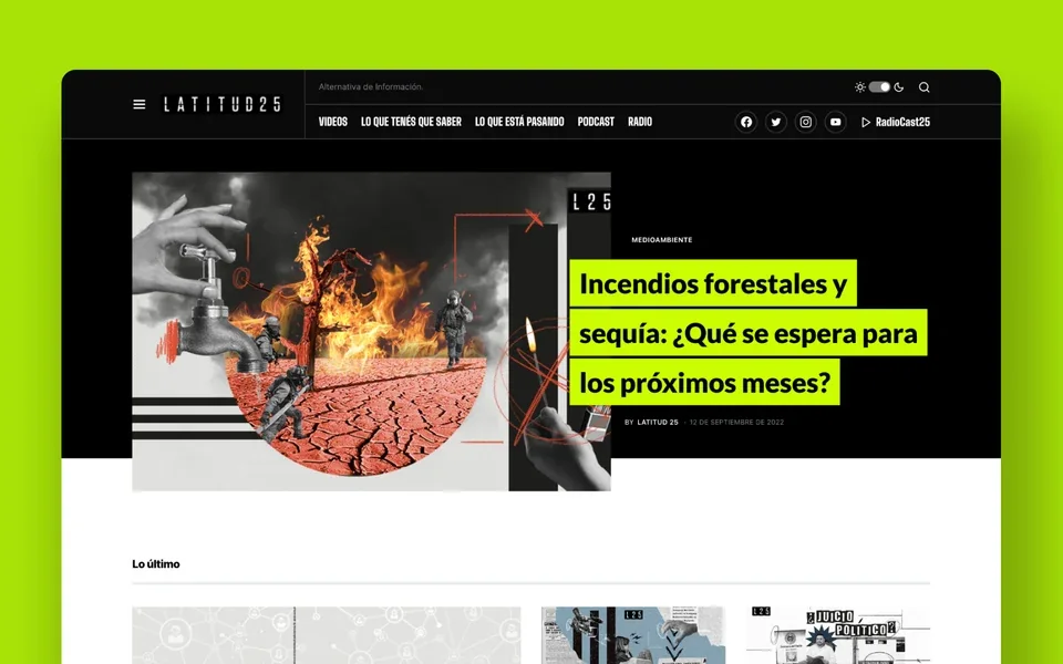
Organization and navigation
Different ways to reach a story.
The header distinguishes video, news, podcasts and radio. Topic listings combine an image, category, headline and short introduction; a recent-posts column provides additional routes on desktop.
The UX approach keeps these information levels recognizable between homepage, archive and article. Readers can explore by format or topic without learning a new structure on every page.
Content pages
Text and audio within the same journey.
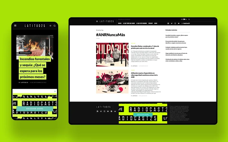
The podcast page gives space to the opening image, title, introduction and player. Publication details accompany the content, and related stories encourage further exploration after reading.
The composition distinguishes primary content from supporting sidebars. Alignment, margins and spacing maintain a clear reading order when images, text and audio share the page.
Mobile adaptation
The hierarchy carries through one column.
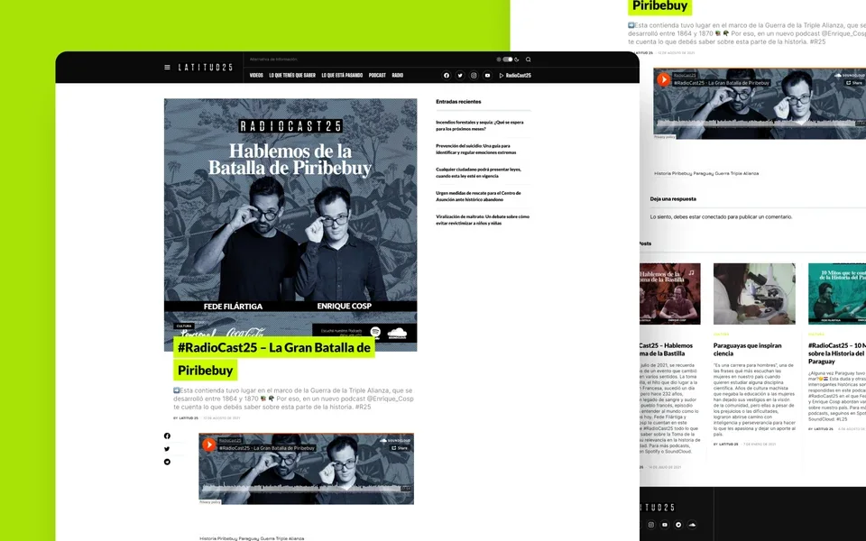
On mobile, the header brings together the menu, brand and navigation shortcuts. Featured headlines span several lines, and images introduce each story before the article body.
The vertical sequence maintains the distinction between heading, introduction and body text. The layout retains the publication's character while keeping content at the center of the experience.
Color and composition
An accent that identifies the publication.
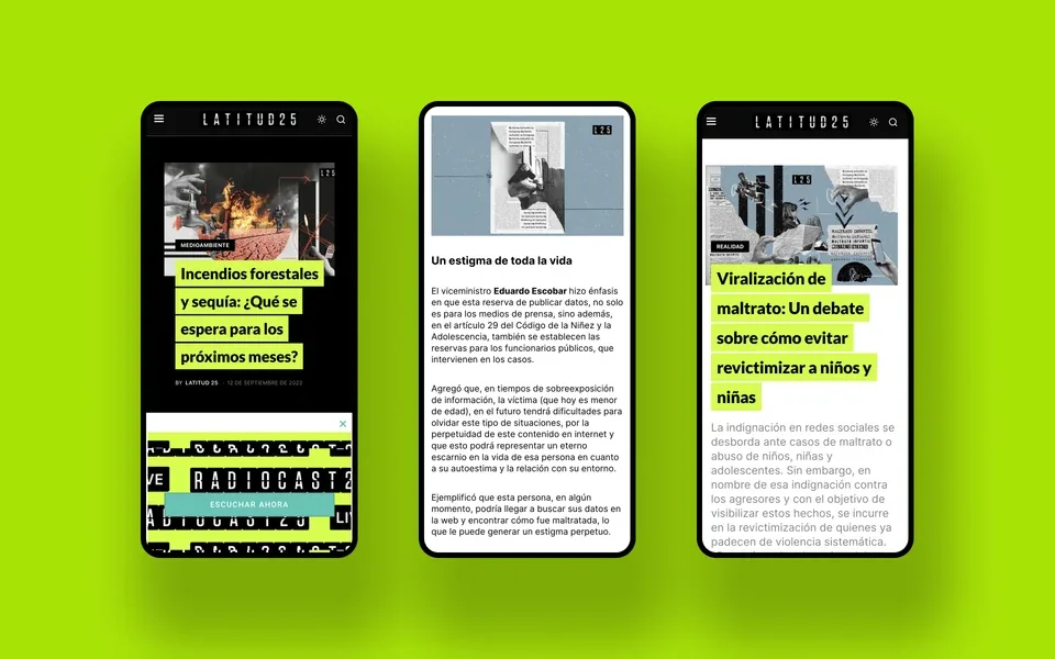
Lime green highlights headlines and categories against black and white. Selective use connects the screens without competing with collages and photography.
Light and dark views share the archive structure. Strong headline typography and more restrained supporting text distinguish quick browsing from in-depth reading.
Contact
Let's talk about your next project.
We can review your organization's context, content and design requirements.